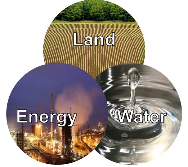
 I’ve talked a lot about the inextricable link between the energy and water sectors, but land is a third component in this nexus that’s starting to gain recognition – and the U.S. Department of Energy (DOE) is taking note. In fact, they recently released a 250-plus page report on the energy-water nexus (which I explore in-depth in a recent blog post) with accompanying visuals to illustrate the connection between these three sectors.
What is a Sankey diagram?
The primary graphic used to illustrate the connection between these three resources is the Sankey diagram. At first glance, it may make your head spin, but Sankey diagrams are commonly used to visualize energy transfers (although they are also used for other things, such as migration flows).
For example, the Energy Information Agency (EIA) uses Sankey diagrams in its Annual Energy Reports to illustrate the production and consumption of different energy sources. Since the width of the arrows corresponds with quantity, the viewer can easily see where the biggest impacts lie. In this case, it’s clear to see which energy resources are gulping down our water. Read More






 You probably have some sort of insurance – for your healthcare, car, house, or apartment. Acting on climate change is also like insurance. It is all about managing the risks.
 Today is