


Mapping Lead: Ohio issues map of properties with known lead hazards
Written By

Share
Tom Neltner, Senior Director, Safer Chemicals Initiative, and Roya Alkafaji, Manager, Healthy Communities
What Happened: The Ohio Department of Health published an interactive map showing almost 1,200 properties whose owners have refused to comply with an order to correct known lead-based paint hazards. As a result, the Department has declared these properties are unsafe to live in until the hazards have been remediated.
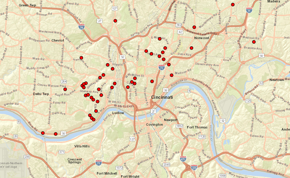
Why It Matters: The availability of address-specific information is important to engage residents, potential home buyers, and renters so they can make better informed decisions about protecting their families from harmful lead exposure. Ohio is the second state after New Jersey that we’re aware of to move beyond neighborhood-level mapping of lead risks to provide specific information at the address level.
Currently, the map doesn’t include information on the locations of lead service lines in Ohio, which are the main source of lead in drinking water. We anticipate the State will make this information available when the drinking water utilities submit the data to Ohio EPA in October 2024.
In the meantime, we encourage Ohio state agencies to add more information on sources of lead exposure, such as lead service lines, lead-contaminated soil, and nearby commercial operations that release lead, as well as details on lead poisoning prevention requirements. By doing so, the map will become a critical tool in the effort to comprehensively consider lead risks and drive exposure closer to zero.
Our Take: The mapping project is another example of leadership on preventing lead poisoning. Other states should consider adopting similar mapping projects to benefit their residents.
Go Deeper: Our Mapping Lead blog series highlights ways in which interactive, address-level maps help families and communities take action to reduce lead exposure. If you are interested in learning more about what a lead exposure map like Ohio’s or New Jersey’s could look like in your community take a look at existing maps: