


Lindsay McCormick, is a Project Manager. Tom Neltner, J.D., is the Chemicals Policy Director.
Developing inventories to document and share what water utilities know – and do not know – about lead service lines (LSLs) with the public is a difficult, but critical, step in creating an effective LSL replacement program.
States can play an important role in collecting estimates of the number of known and potential LSLs for each utility and shaping how that information is communicated to the public. 14 states have surveyed utilities operating community water systems in their state to acquire such information.
States have made this information publicly available through different methods. Some have posted individual utility reports, while others have provided a report summarizing the findings. In analyzing the approaches, we found that no state currently makes the results available in a format that allows the public to easily see the information from multiple utilities.
But in today’s world, people typically expect data to be presented in a visually friendly and digestible format. So as a model, we decided to create a state-level map of LSL information.
Of the 14 states, we found that Indiana has one of the most robust surveys, asking detailed questions about portions of the service line containing lead, information sources checked, and service line ownership on public versus private property. Further, it has a good response rate for a voluntary survey. While only 57% of systems responded, these systems account for 92% of the service lines in the state – as most non-respondents were primarily smaller community water systems.
EDF acquired a spreadsheet from the Indiana Department of Environmental Management and combined this information with data from EPA’s State Drinking Water Information System (SDWIS) to develop a map of LSLs in Indiana as a model.
What does the map show?
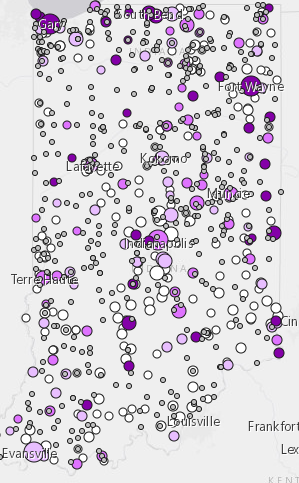
- Dot size: Number of service connections in a community water system (range).
- Dot color (purple shades): Percentage of service connections with a lead portion (range).
- Dot color (grey): Those community water systems that either did not respond to the voluntary survey at all or that did not respond to the questions on LSLs.
- Clickable dots: Clicking on any dots shows more detailed information for a single community water system, including exact number of service connections and percentage with a lead portion; whether the information is based on estimated or recorded data; and the community water system’s Lead and Copper Rule 90th percentile
What does the map not show?
Indiana’s two page voluntary survey asked its respondents some helpful questions that we did not incorporate into the map. Such information includes (which you can learn more about from our previous blog):
- Presence of lead in different portions of the service line (i.e., public side, private side, gooseneck, or the entire line);
- Unknown service line material, i.e., potential LSLs (of note, utilities report 268,000 service lines where made of unknown material – more than the number of known LSLs);
- Sources or records checked for service line information;
- Confidence in information sources (1-10 point scale);
- Ownership of the public and private portions of the service line; and
- Legal citation or ordinances that establishes the ownership of the service lines.
Indiana map as a model
The best way to map LSL information is likely to change from state to state, depending both on the survey instrument utilized to acquire the data and the types of responses received. We don’t suggest that we have figured it all out. We provide this map simply as an example for consideration and encourage states to explore this and other options.
Click here to check out the map and explore the data.
[Post corrected June 3, 2019.]