


This blog was co-authored by Kate Roberts.
This week we published a new study that combines locations of active oil and gas wells with census tract data in a way that helps us better understand the characteristics of the communities living near them. Our findings support what environmental justice groups have been voicing for years: in many counties across America, people who have been historically marginalized–communities of color, older Americans, children, and people living under the federal poverty line–often live near wells in greater proportions than the other groups that make up the rest of their local county.
In addition to publishing these data with our study, we also used it to develop an interactive tool, which users can access to explore how each of 13 different demographic groups relate to oil and gas wells across all US counties.
Case studies show the impact of overlapping demographics
For a long time now, EJ advocates have voiced the importance of taking a broader view of environmental stressors, and move beyond simply exploring outcomes for a single pollutant or population in isolation. In their seminal paper on this issue in 2011, UC Berkeley’s Rachel Morello-Frosch and her coauthors illustrate how critical it is to reframe our thinking around cumulative exposures and vulnerabilities, so that we may address environmental disparities.
A central aspect of our paper is to embrace this view: we developed an index to highlight the places with substantial overlap of historically marginalized groups, and where we also found a high density of active wells. We found about 41 clusters of interest across the country, which are predominantly located in three specific regions: California, the Southwest, (San Juan, Eagle Ford and Permian Basins in Texas and New Mexico), and Appalachia. The main demographic characteristics represented in these are outlined in the map below:
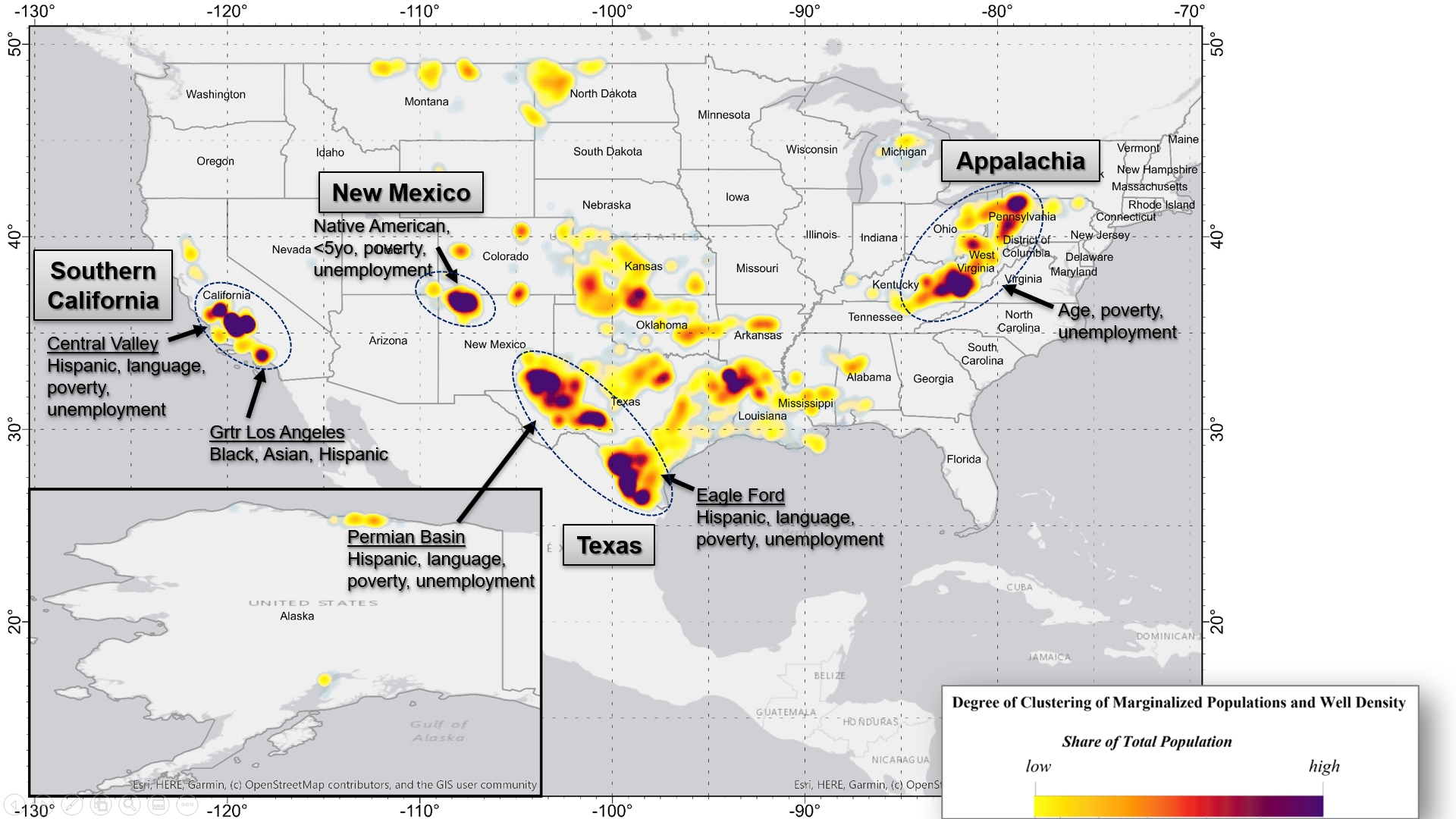
Taking a closer look at the Permian Basin (where EDF has conducted a methane monitoring initiative), one can clearly observe an abundance of active wells (the white dots). Certain counties here show a lot of overlap across historically marginalized groups, such as Lea and Eddy (in New Mexico), and Andrews, Crockett and Sutton (in Texas).
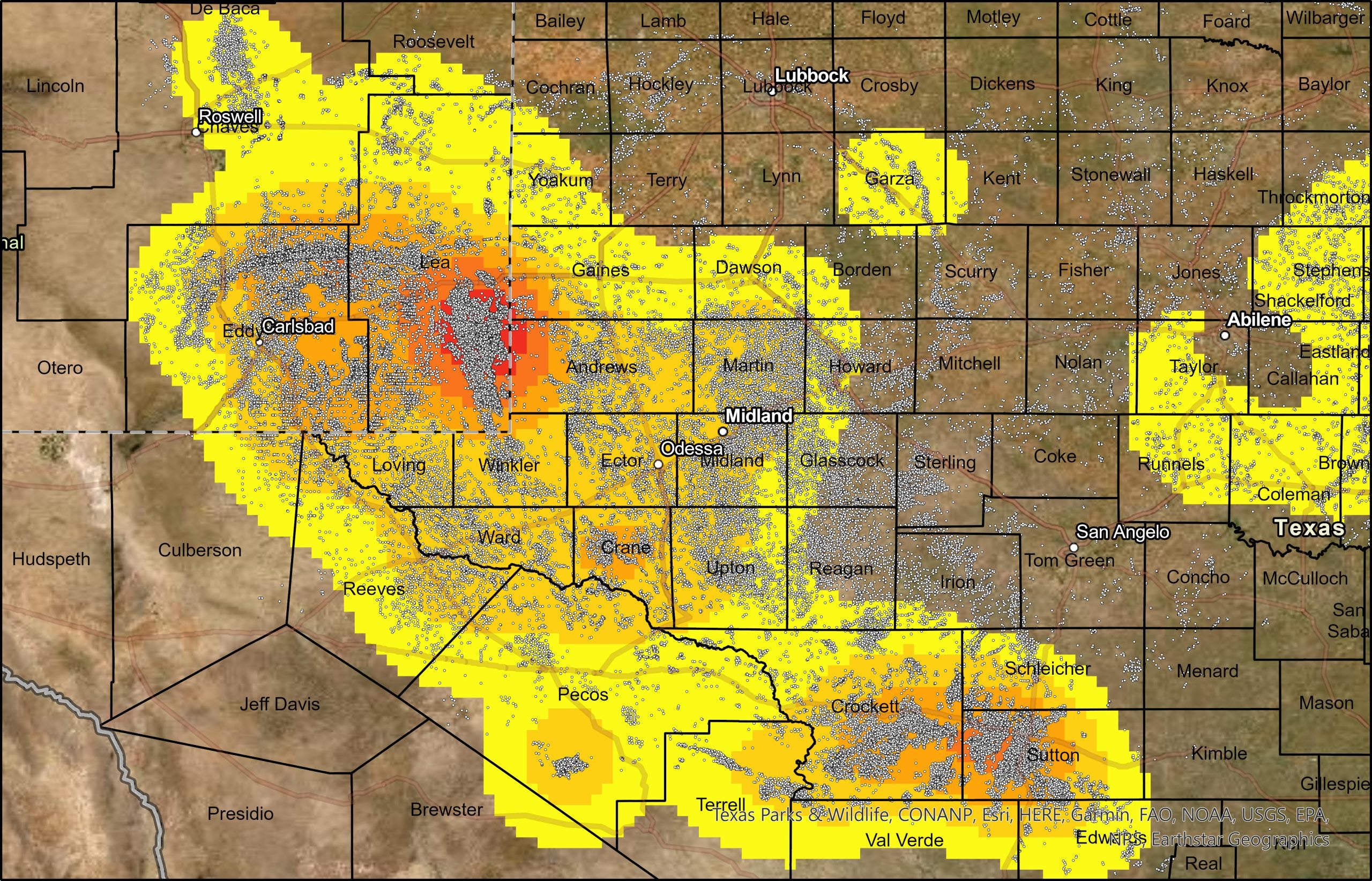 For example, in Lea county, Hispanics, children under 5, and unemployed individuals compose 59%, 9%, and 7% of the total population, respectively. Compare this to averages of 24%, 7%, and 4% across all counties across the US where wells are found.
A basis for both current and future study
Users can explore the full data set, for all US counties, to learn more about the people living within 1, ½ , ¼, or 1/10th of a mile of active oil and gas wells. This kind of information can be useful to a variety of organizations, like environmental justice and community groups to highlight threats faced by people on the front lines, or health researchers, who can use this data to research projects delving into the health and other impacts associated with oil and gas operations.
It could also prove useful for policymakers concerned about the threats faced by their constituents, and to shape better policies. For example, local, state and federal officials could use the data as they consider requirements designed to protect those who live in closer proximity to oil and gas wells, like more frequent leak inspections, appropriate setbacks, mitigation efforts to reduce light, noise and dust impacts, provision of information and services to populations in multiple languages, and the reduction of heavy truck traffic, as well as the elimination of high-polluting pneumatic devices and routine venting and flaring.
The new analysis comes as the EPA is considering new requirements to limit methane pollution from oil and gas wells across the U.S. Leading states including Colorado and New Mexico have established requirements in recent years that help protect frontline communities from oil and gas pollution including regular inspections at smaller wells with leak-prone equipment and bans on routine flaring. EPA will have the opportunity to build from these comprehensive approaches when it issues its supplemental rule proposal later this year.
Our methods used in the study can also be applied towards other environmental stressors. For example, EDF has used the same approach to explore communities living near large warehouses that attract polluting truck traffic, and other petrochemical facilities across the United States.
As you explore the interactive dashboard, let us know what you think. How can this data be made useful and supportive towards your own goals? Are there other ways it should be presented, or adapted so that it can be more effective? We’re happy to help you learn more about how you can make sense of it and what it means for your local community. Please feel free to get in touch, and we hope to include your feedback in future versions of this tool and as we build out more population mapping efforts.