


Links: Cool Graphics and Magic Tax
Posted: in Climate Change Legislation
Written By

Share
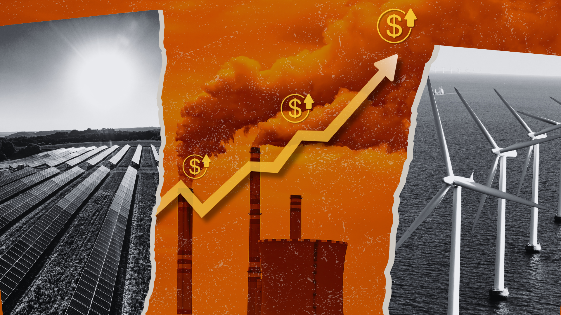
In case you missed it, washingtonpost.com featured a set of graphics about a carbon cap on its home page all last weekend. A couple of them looked very familiar to us. Take a look.
We’ve been using a graph that tracks the price of emitting acid rain (sulfur dioxide) pollution for years now — like on this page, on how a cap works. Which of these illustrations do you think are most useful?
I was also intrigued by a post by Eric de Place over on Grist. He describes a cap on carbon pollution as a “magic self-adjusting carbon tax.” It’s a nice explanation of a cap’s price flexibility, which is one of its key advantages.


2 Comments
Two questions:
(1) How does cap and trade apply to the transportation sector? That sector is also a major source of GHG.
(2) Will allowances be allocated to electricity suppliers based on the amount of energy supplied to the market, or on the amount of GHG they produce? The former rewards those with relatively clean energy portfolios, while the latter rewards those that are heavy polluters.
Thanks for the questions.
You’re right that transportation is a major source of GHGs — in the U.S. transportation is roughly 30 percent of all global warming pollution. USCAP (EDF is a member) has a blueprint for legislation that puts transportation fuels under an economy-wide emissions cap, ensuring that we get needed reductions in the trans sector. You can read more about that in the blueprint: http://us-cap.org/pdf/USCAP_Blueprint.pdf.
On your second question, Congress has yet to decide among the many options for how to distribute allowances.