


Picturing U.S. Carbon Emissions
Posted: in Greenhouse Gas Emissions
Written By
Share
 This post is by Sheryl Canter, an online writer and editorial manager at Environmental Defense Fund.
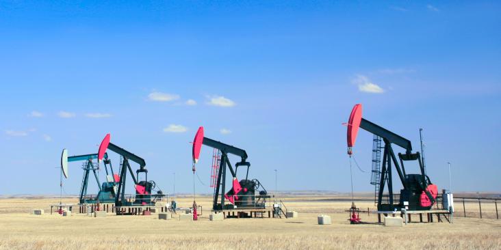
How much do different sectors of the U.S. economy contribute to greenhouse gas emissions, and how much does this vary by region? That’s a complicated question, but you can see the answer at a glance through a nifty, interactive map on the New York Times Web site.
A bar across the top gives the overview by sector – electric, transportation, industrial, residential, and commercial. Click on a bar to see the breakdown by state, shown on a map of the U.S. via proportionally-sized circles. When you hover your mouse on a circle, you see text with the state name and million metric tons of emissions.
If you’d like to dig into the numbers in full, gory detail, check out the latest U.S. Greenhouse Gas Inventory Report.