Fossil fuels haven’t lost the race, yet. Here’s the full story.
 A recent Bloomberg New Energy Finance article made a splash saying that fossil fuels “just lost the race against renewables.” It included a striking chart, depicting changes in power capacity additions with very clear diverging trends.
Although this would be a delightful turn of events, we should be wary of putting the cart before the horse.
What may be lost on many readers is the fact that Bloomberg bases its story on power capacity, rather than actual power generation.
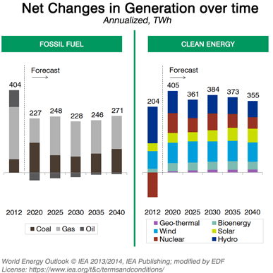
Here is a graph depicting net changes in generation over time, using data from the International Energy Agency:
This bar chart tells a different story than what Bloomberg’s graphic showed.
To get the full picture – and to accurately assess how far we’ve come in our much-needed transition to a clean energy economy – we need to understand power sources can differ a great deal. This has direct bearing on whether renewable energy is, in fact, outcompeting fossil fuels.
Renewables such as solar and wind typically operate with much lower capacity factors than fossil fuel sources do – often generating energy between 20 percent to 40 percent of their maximum capacity. With coal plants, however, this number would typically be upwards of 80 percent.
Another critical aspect is retirements. New additions are important, but given that power plants are retired every year, it helps to look at net changes over time.
While we might still expect future generation in renewables to exceed fossil fuels, this shows there isn’t necessarily a clearly diverging trend – yet. This is especially true given that such projections are conditional on changes in costs, fuel prices, and future policy shifts that we can’t reliably predict.
One thing is clear: We still have a lot of work ahead of us to create a clean energy future for our planet.
Photo source: Flickr/Nick Humphries
This post originally appeared on our EDF Voices blog.


