Climate change solutions
We deliver game-changing environmental solutions that have a real impact for people around the globe.

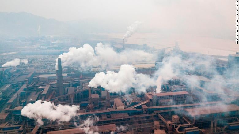
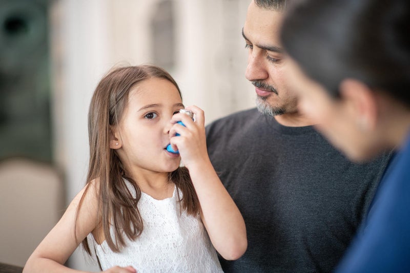
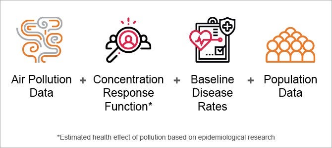
Air pollution can be deadly. Learn how to combat it using scientific research and local emissions data to improve health where you live.